287(g) Watch Recovered Factory · May 2026 Svelte / data visualization / mapping / investigative / AI / Python / R Studio / interviews
Why NYC nurses went on strike, again Data Visualization Society · February 2026 Adobe Creative Suite / web design / social first design / UI / color theory / Git / data analysis / javascript / GitHub / multimedia
Where the White House is leading us with TikTok Columbia Journalism Review · December 2025 social media analysis / python / LLMs / NLPs / disinformation / algorithmic accountability
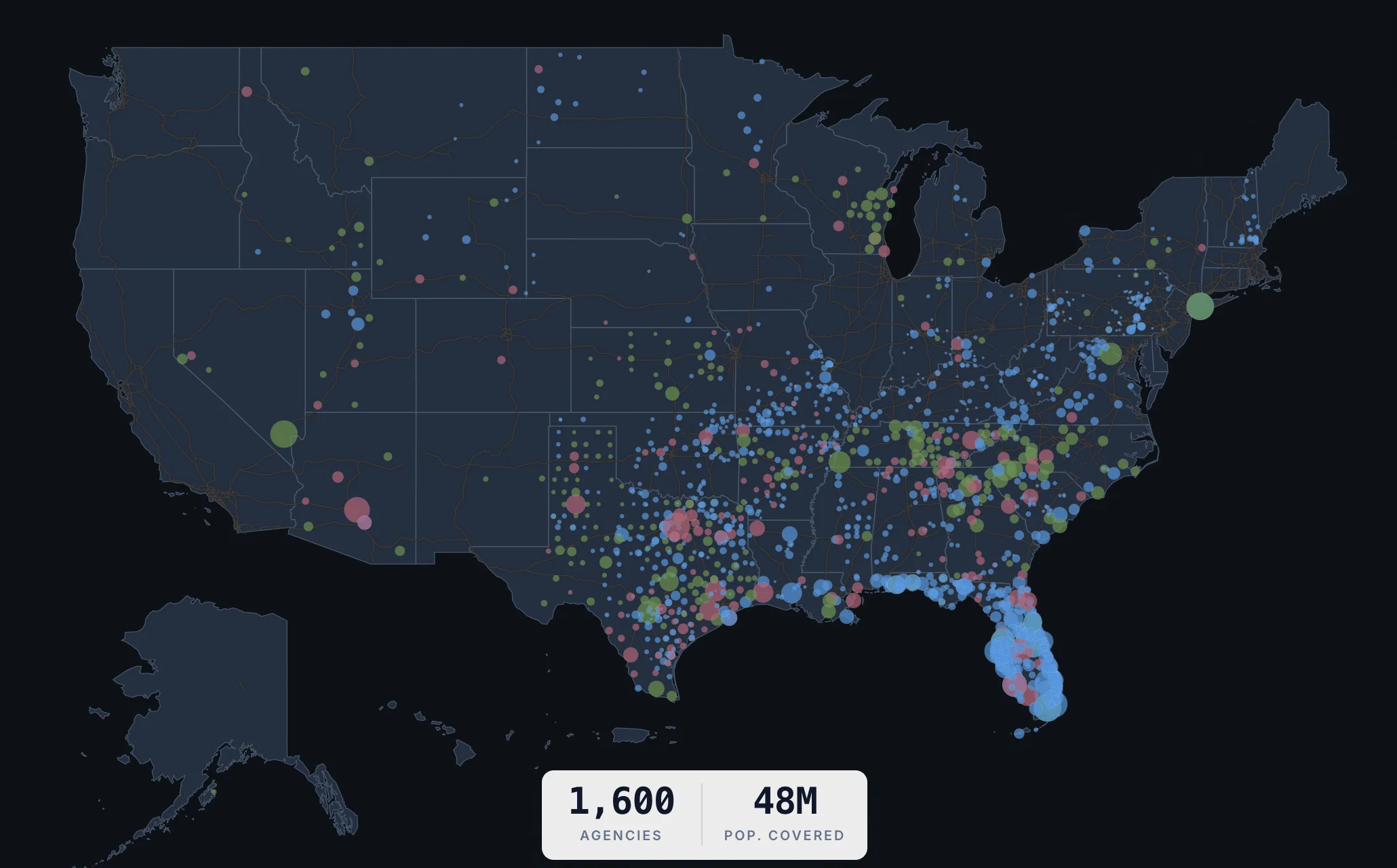
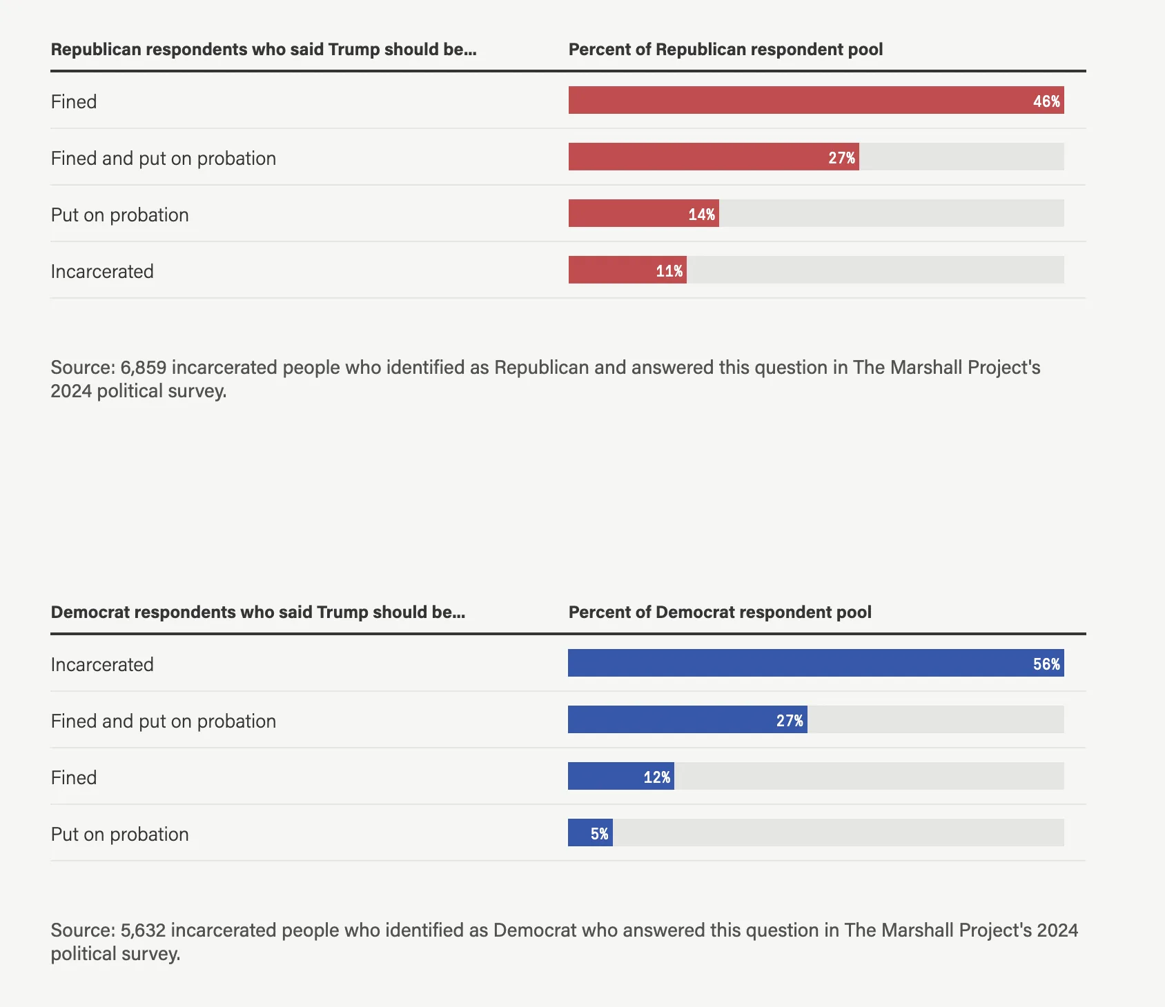
We surveyed 54,000 people behind bars about the election Marshall Project · April 2025 Part 1 · Journalist toolkit Dagster / ETL / Python / Observable / Adobe Illustrator / NLPs / AI
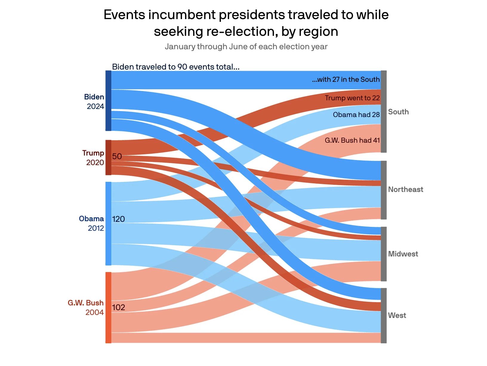
Biden's travel schedule is lighter than almost all other U.S. presidents Axios · July 2024 Adobe Illustrator / ai2html / JavaScript / web scraping / data reporting / politics
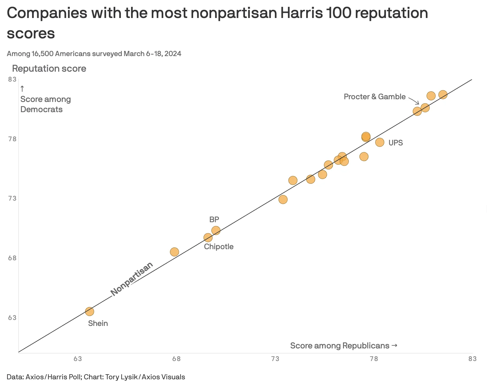
The most nonpartisan companies, ranked by Americans Axios · May 2024 polling data / Python / Svelte / data visualization / data analysis
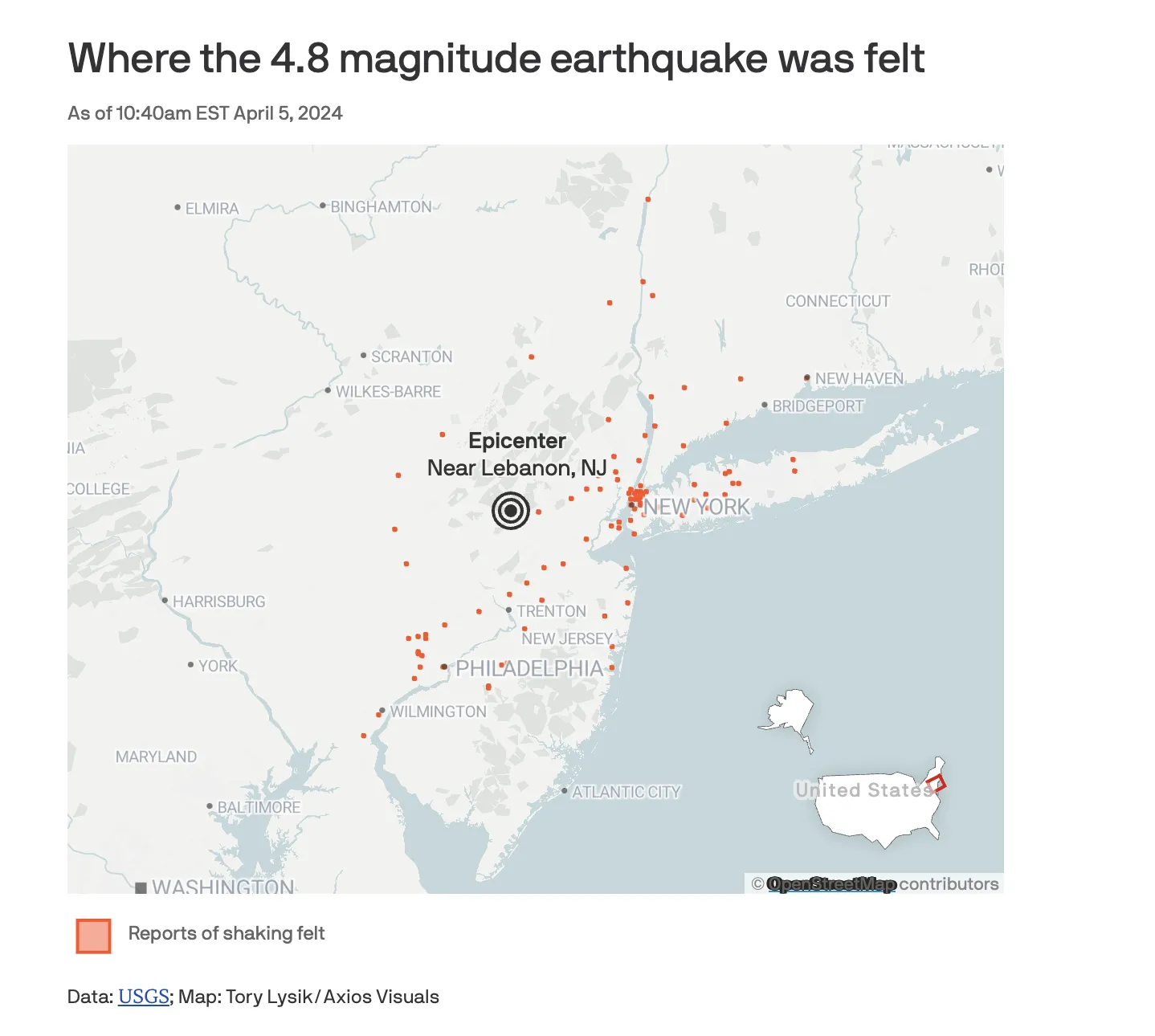
Earthquake rattles the New York City area Axios · April 2024 breaking news / mapping / data reporting
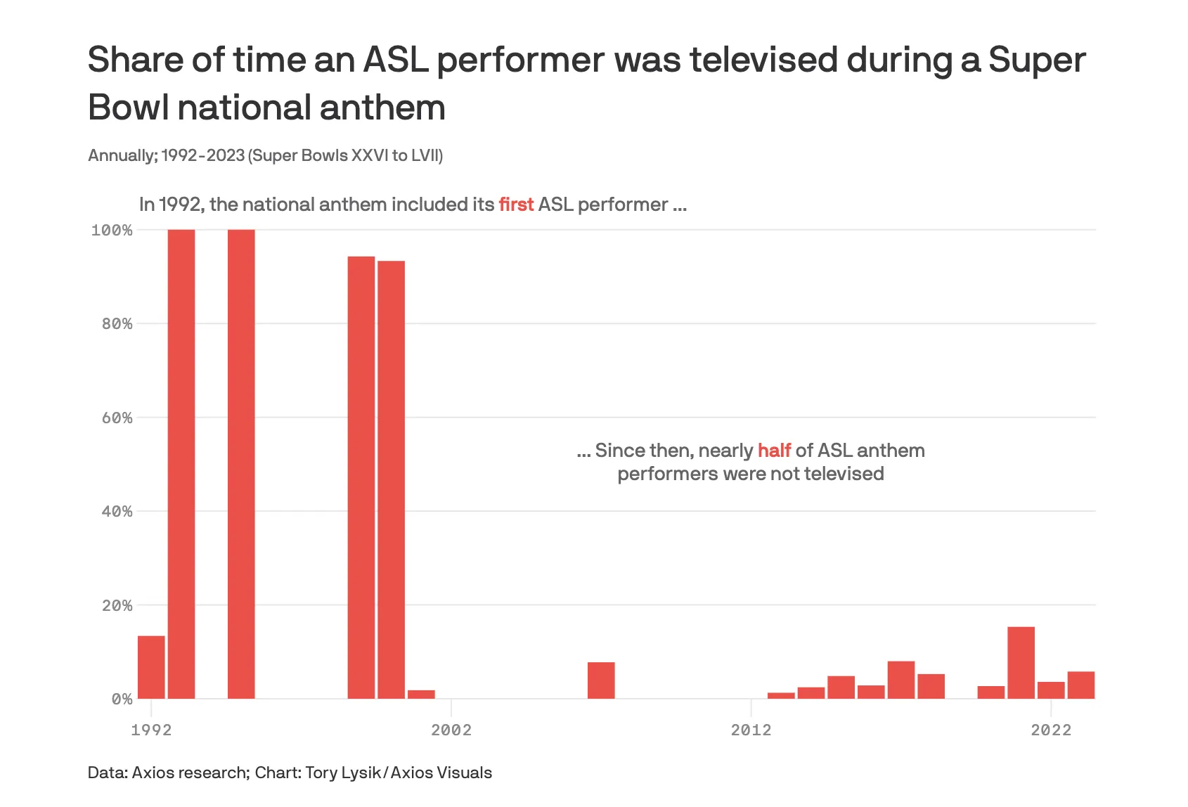
Super Bowl broadcasts have mixed history of screen time for sign language performers Axios · February 2024 svelte / python / data visualization / OSINT
No passport? No problem Axios · January 2024 Information is Beautiful Awards: 2023 Finalist D3 / svelte / react / R / node.js / UI design / Cartography / responsive design / CSS / Tailwind
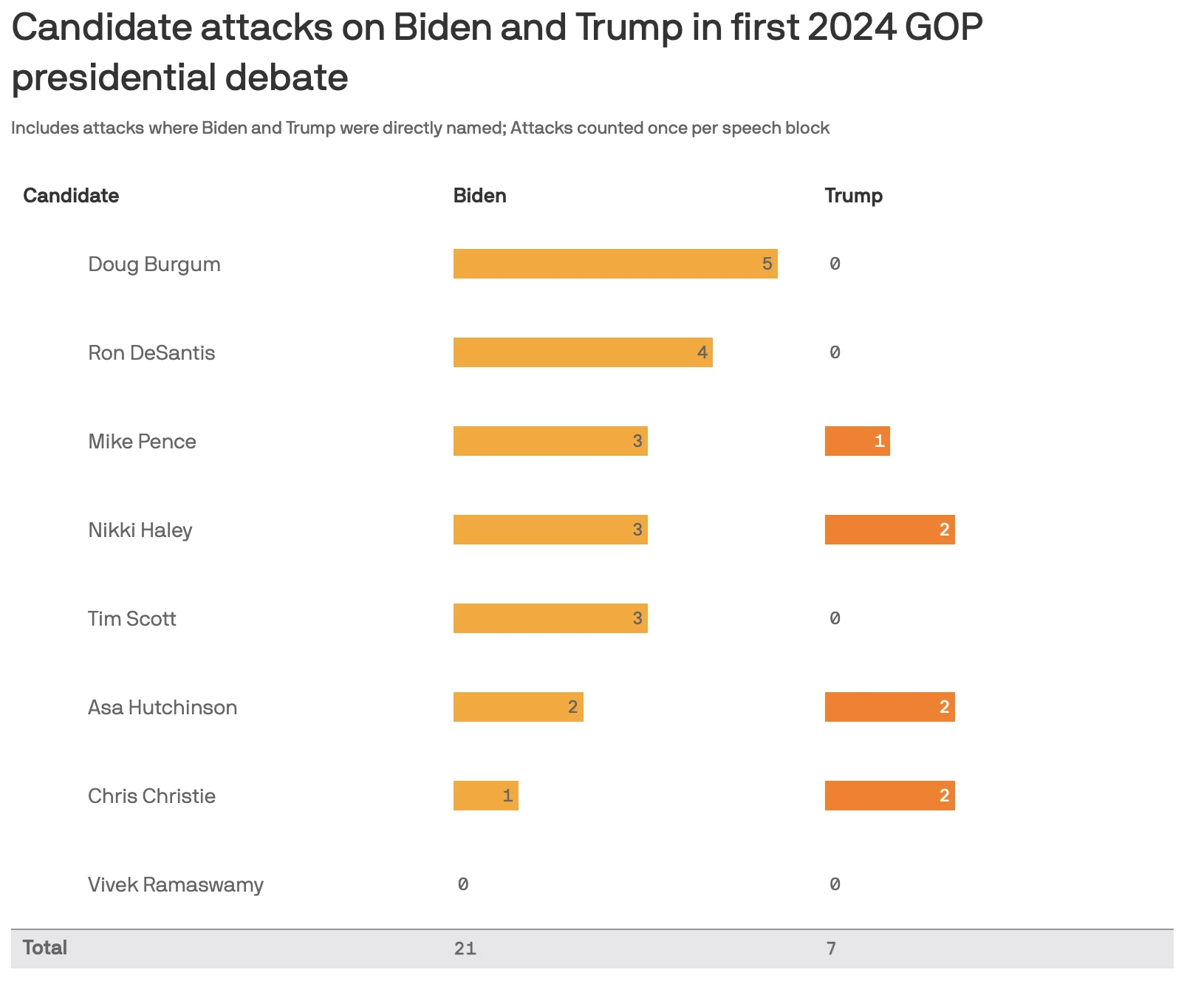
How GOP candidates treated Biden and Trump at the first debate Axios · August 2023 breaking news / quick turnaround / Svelte / Python / text analysis / politics / data reporting
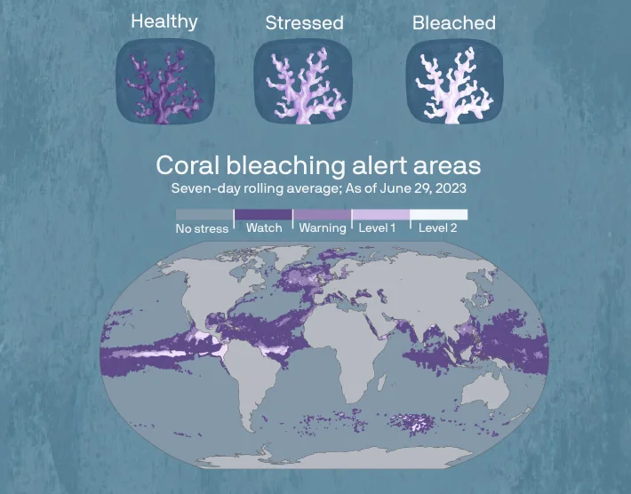
500 million people depend on reefs for survival. The next El Niño could kill that coral off completely Axios · July 2023 environmental / adobe illustrator / data visualization
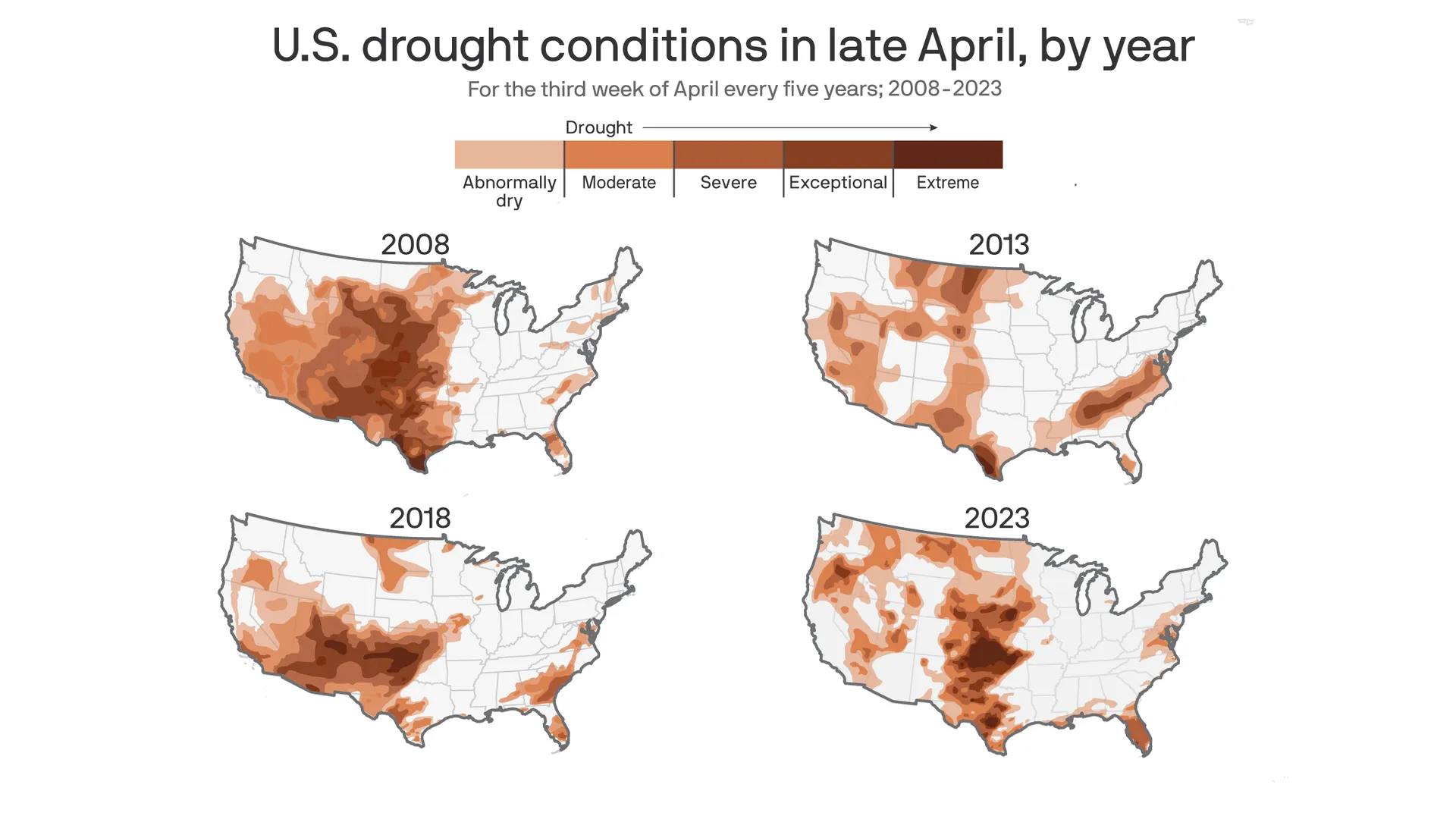
Drought just hit a 3-year low. Here is how that is a bad thing in four maps. Axios · April 2023 mapping / GIS / MapShaper / R / ai2html / Adobe Illustrator / web scraping / data analysis / environmental
The Making of Brian Kemp Axios · October 2022 Georgia Press Association: 2022 Best Newsletter and Profile Story data reporting / finance / politics / elections / finance/budget analysis
Denver’s Central 70 project: Digging in troubled ground Denver Gazette/Colorado Politics · January 2021 Colorado Press Association: Best Investigative Story and Best Editorial Collaboration of 2021 politics / environmental / local reporting
Scraper Factory Tow Center for Digital Journalism · April 2026 Part 1 · GitHub web scraping / Python / AI / teaching
The Buildout: How AI data centers are reshaping America Personal project · January 2026 data visualization / mapping / Cartography / AI / environmental / Svelte
Crypto magazine data analysis and visualizations Use Case Magazine · October 2025 Adobe Illustrator / Photoshop / Procreate / data analysis / UI / print design / HTML
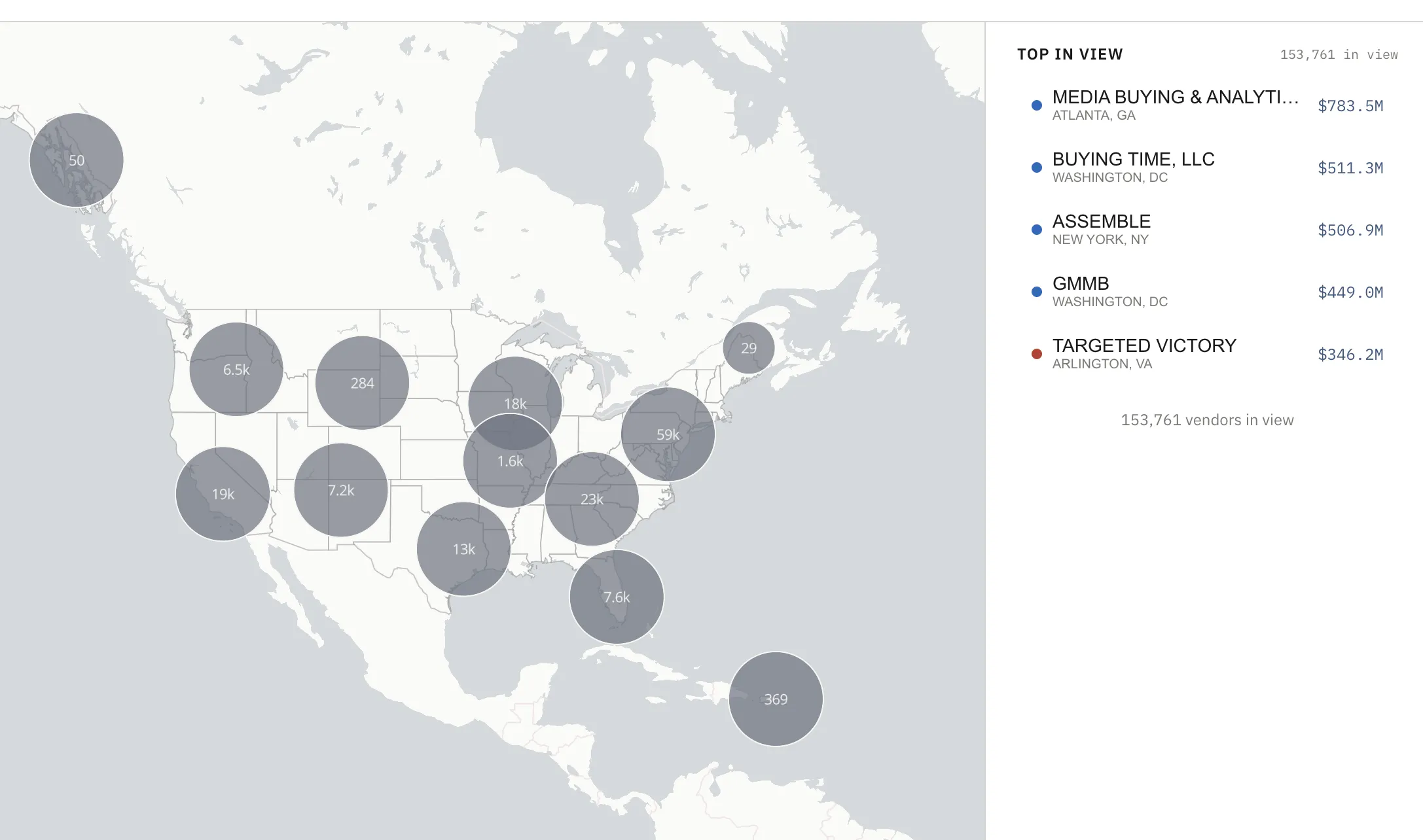
Political Cash Flows Personal project · January 2025 data visualization / politics / finance / JavaScript / interactive design
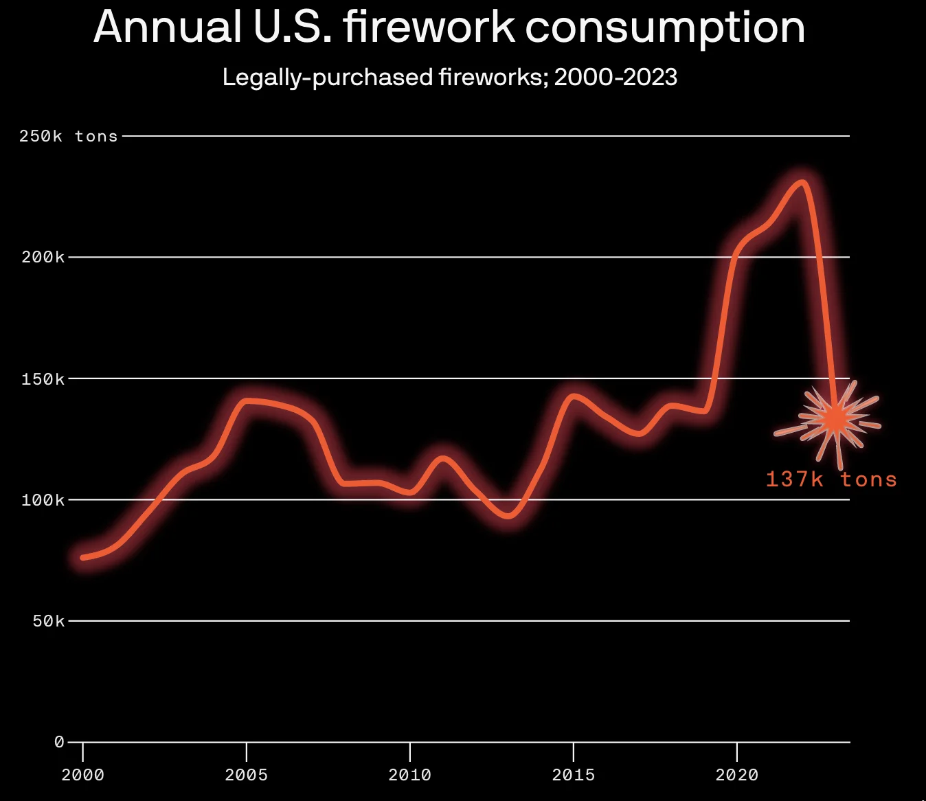
Americans are still setting off record amounts of fireworks Axios · July 2024 quick turnaround / Adobe Illustrator / ai2html / JavaScript / data visualization
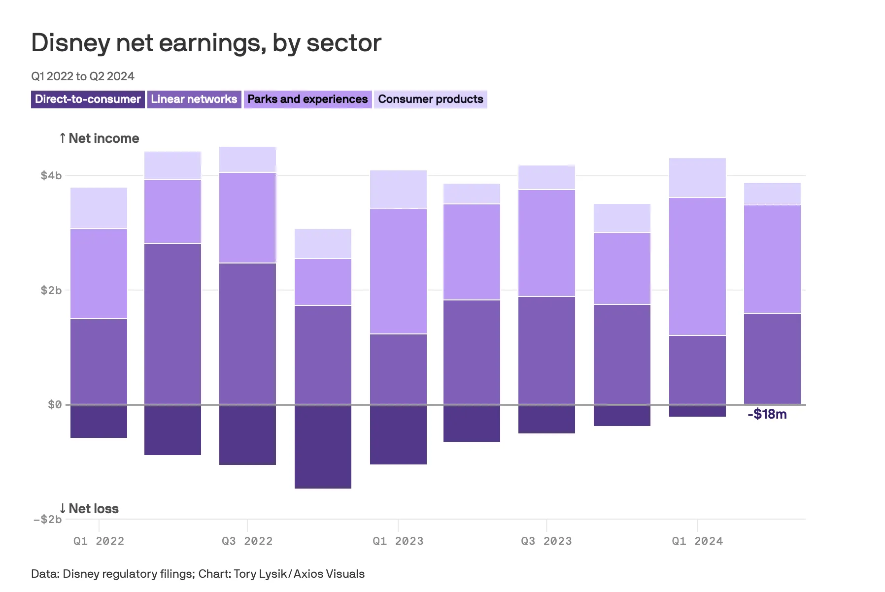
Disney's entertainment streaming business posts first-time profit Axios · May 2024 financial analysis / Python / Datawrapper / AI / HTML / mobile sizing
Cherry blossoms bloom earlier—then face deadly frosts Axios · April 2024 local reporting / adobe illustrator / data reporting / environmental / color theory
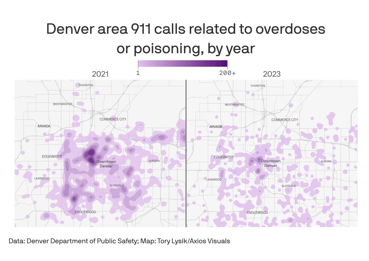
In Denver a controversial bill caused overdose deaths to rise while emergency calls fell Axios · February 2024 Colorado Press Association: Best Infographics & Best Newsletter of 2024 QGIS / ArcGIS / Python / UI / R / Mapbox / APIs / Geocoding / FOIA
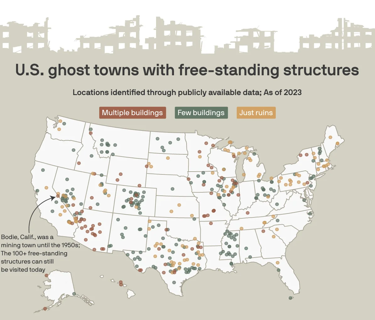
Arkansas's ghost towns, mapped Axios · January 2024 Adobe Illustrator / ai2html / JavaScript / Python / mapping / local reporting
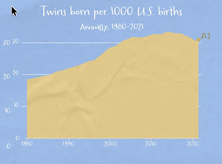
Twin births decline after a decades-long boom Axios · August 2023 data visualization / data reporting / Datawrapper
At risk series: Mapping facilities that house dangerous chemicals Axios · June 2023 Part 1 · Part 2· Interactive map SQL / web development / react / svelte / Mapbox / R / APIs / web scraping / FOIA / UI / Cartography / responsive design / CSS / Tailwind
It’s not just a police problem, Americans are opting out of government jobs Marshall Project · January 2023 investigation / data reporting / react / python / algorithmic accountability
The attack on a prison holding Ukraine POWs, explained Vox · July 2022 data reporting / politics / Washington
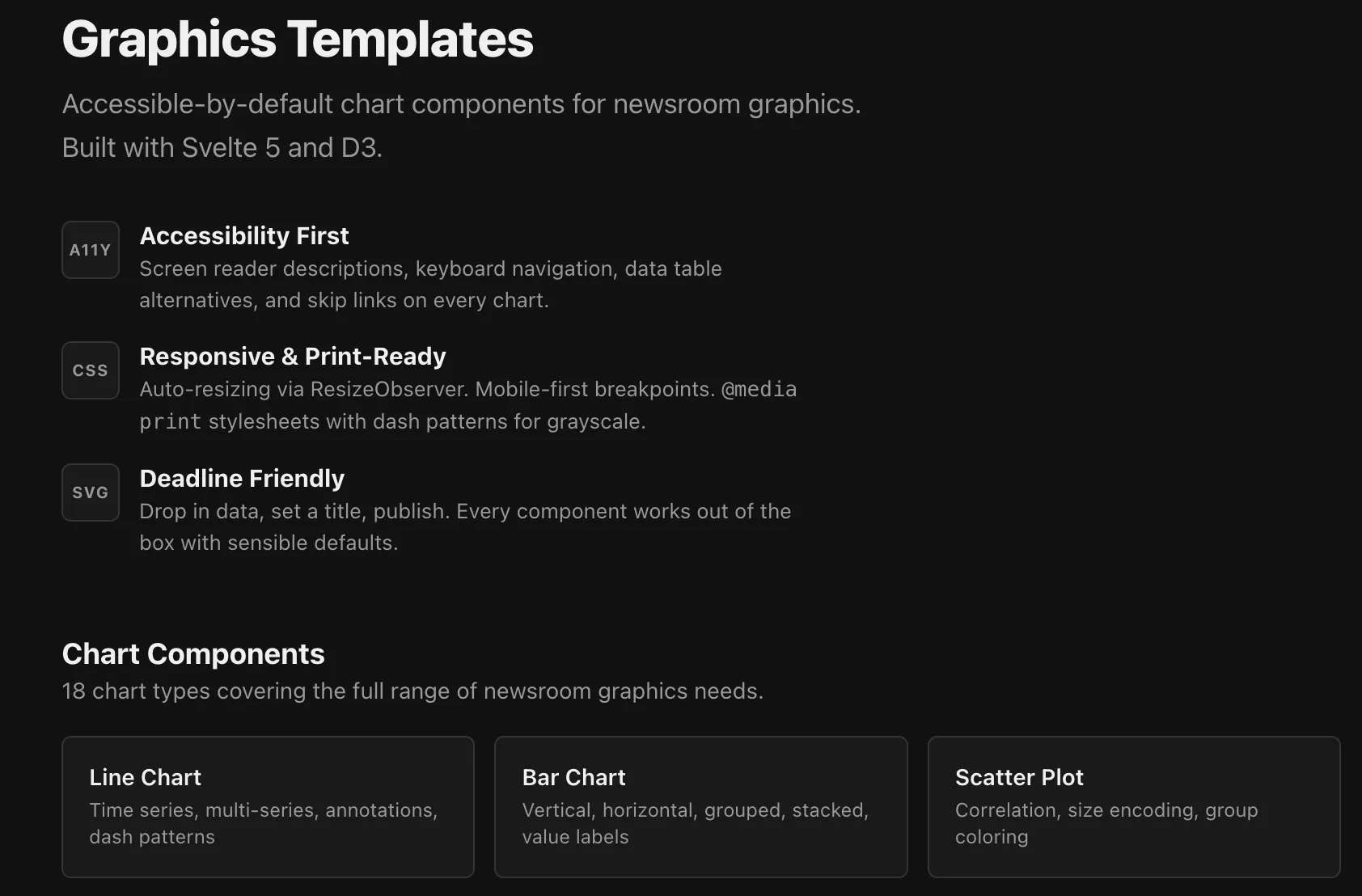
Graphics Templates: Accessible chart components for newsrooms Personal project · April 2026 Svelte / D3 / TypeScript / accessibility / open source / data visualization
Annotation and highlighting tool Tow Center for Digital Journalism · January 2026 react / pdf.js / AI / javascript / Vite / NLPs
Toward AI-powered source audits Columbia Journalism Review · October 2025 AI / LLMs / python / research / algorithmic accountability
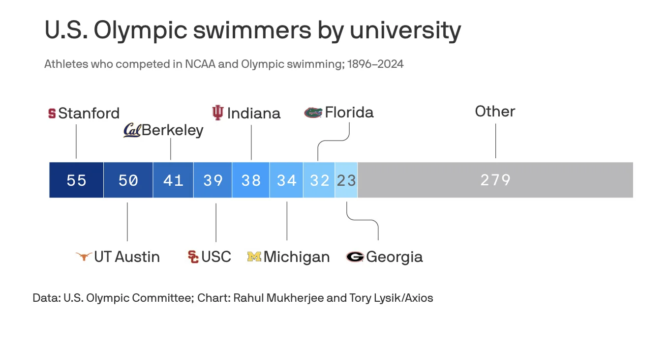
Which colleges are sending the most swimmers to the Olympics Axios · July 2024 Svelte / JavaScript / web scraping / data analysis / data visualization
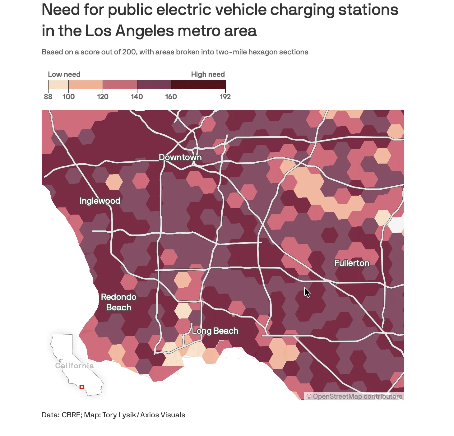
Charging deserts threaten the EV revolution Axios · June 2024 mapping / data visualization / environmental / Cartography
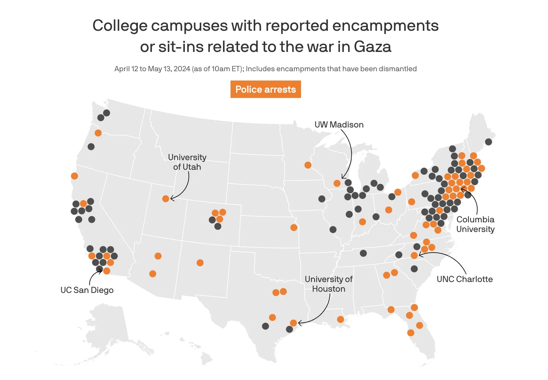
Where pro-Palestinian student protesters have been arrested Axios · May 2024 Cartography / OSINT / safety / web scraping / JavaScript / Svelte / QGIS / interactive design / Three.js / color theory
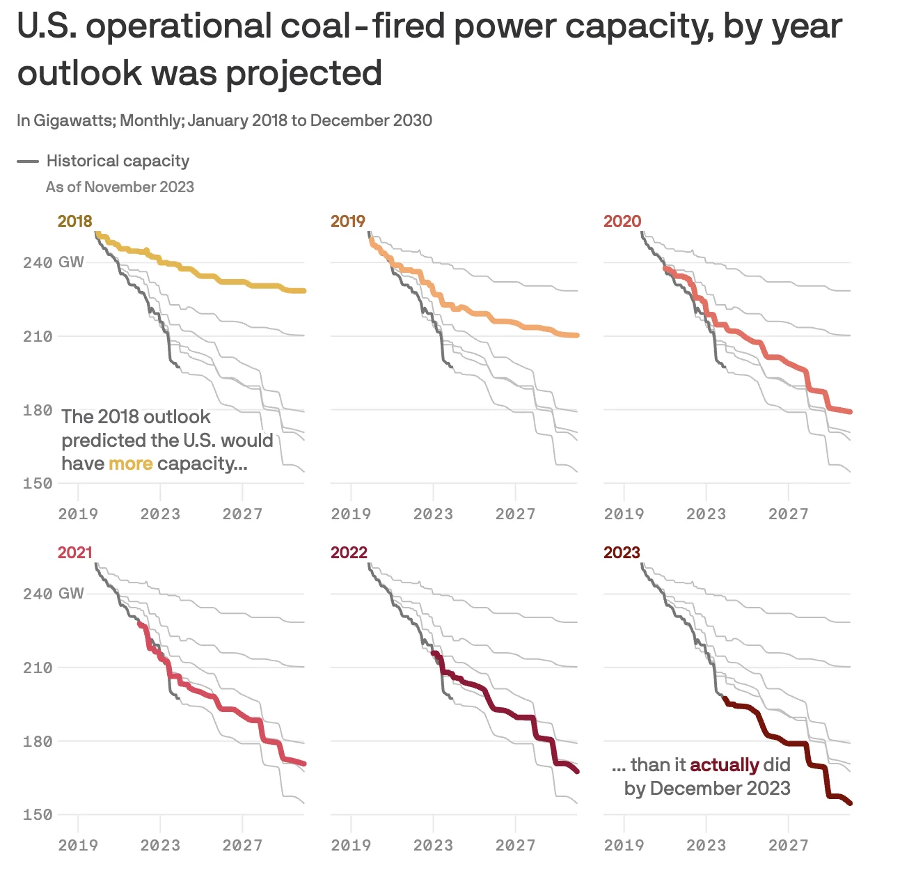
Coal's influence on energy generation is fading fast Axios · February 2024 small multiple / Svelte / Python / data visualization / environmental
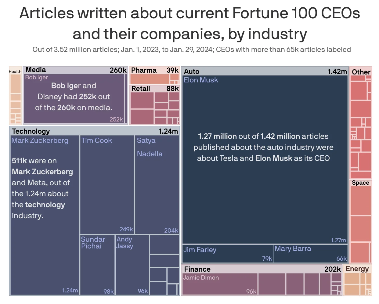
Which Fortune 100 CEOs get the most — and least — media attention Axios · February 2024 Svelte / Adobe Illustrator / Python / ai2html / PDF analysis / data analysis
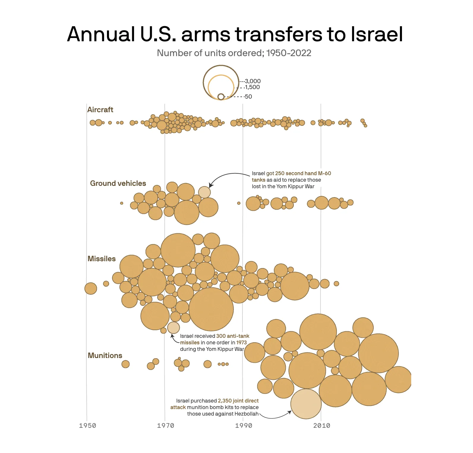
Inside America's 70-year arms pipeline to Israel Axios · November 2023 Svelte / Python / ai2html / FOIA
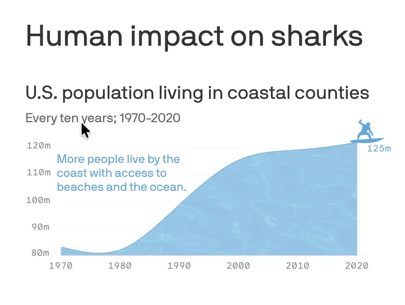
Shark attacks are rare but the real crisis is what we are doing to them Axios · July 2023 data visualization / environmental / data reporting
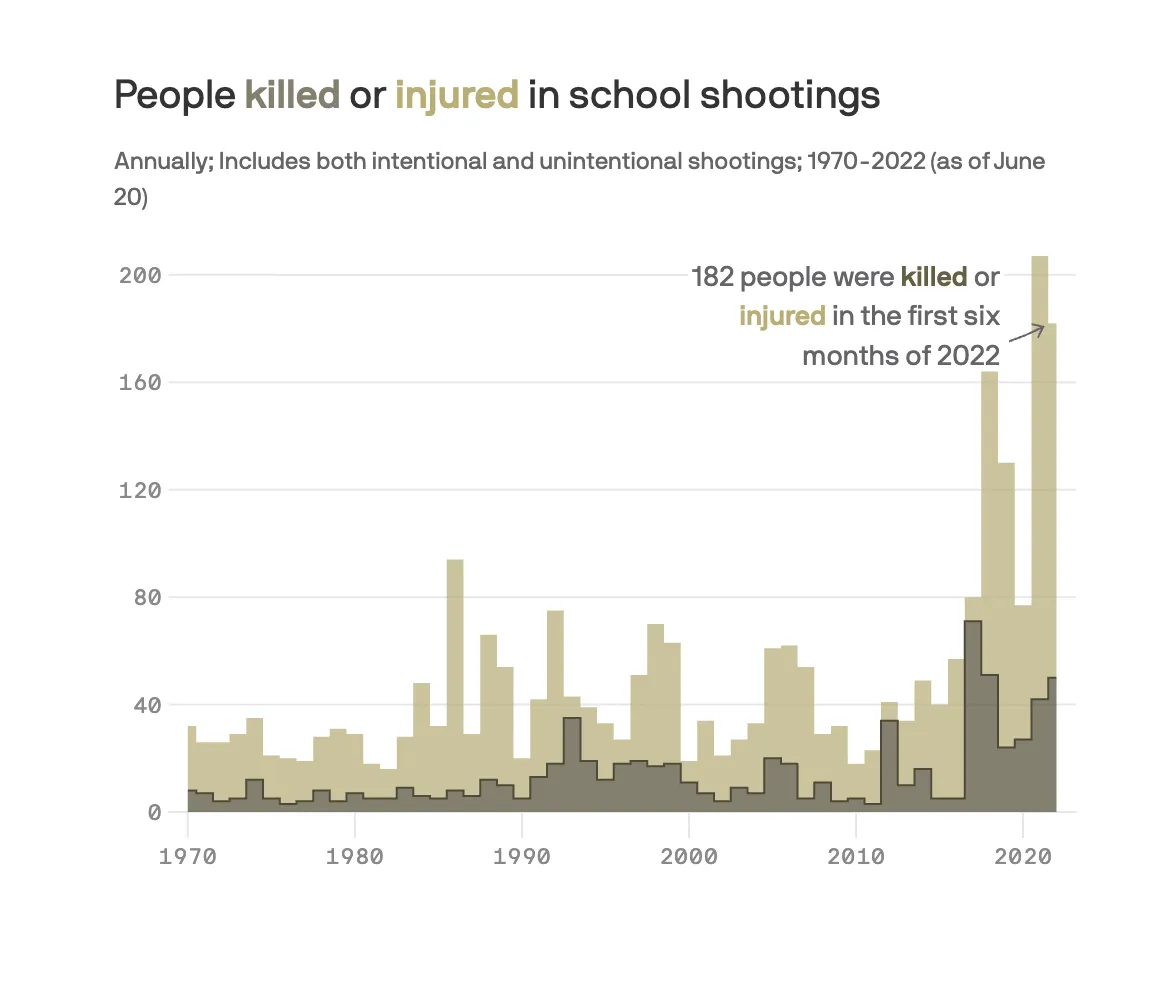
School gun violence torments America's youngest generation Axios · May 2023 Part 1 · School counselors shortage Datawrapper / Python / UI / web scraping / data analysis
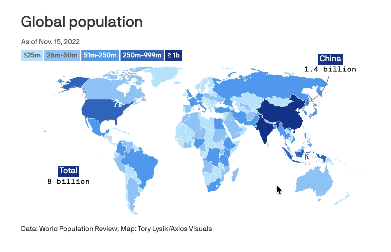
The world just hit 8 billion people Axios · November 2022 data visualization / international / data reporting
Senate Republicans threatened to burn a bill that would have helped veterans Vox · July 2022 data reporting / politics / Washington / NLPs